
Concept 08transformation
Desktop chaos to one clean result
Visualize a workflow pain point and its resolution.
- Length
- 12s
- Beats
- 5
- Frame rate
- 30 fps
- Complexity
- moderate
Change visual density dramatically while preserving one recognizable link.
Use it when
A real workflow outcome can resolve an immediately recognizable pain point.
Pick another concept when
The promised simplification cannot be demonstrated or explained honestly.
What you need
- 4–8 original/simplified UI cards
- One real result image or output card
- Problem and outcome copy
- Logo and CTA
Keep this consistent
The contrast is in visual density: a cluttered start resolves into one dominant result.
Beat sheet
5 beats · 12s

Beat 1 · 0s–1.8s · 1.8s
Hook
Several overlapping windows and a short pain statement.
- Motion
- Offset copies enter every 100 ms; restrained 1–2 px shake on accents only.
- Sound
- Controlled notification rhythm.
- Check
- No intense flashing; text stays readable.
Copy slot:Problem

Beat 2 · 1.8s–4.2s · 2.4s
Pressure
More windows accumulate around the center.
- Motion
- Repeater or duplicates advance by 12–20 px; keep within parent group duration.
- Sound
- Rhythm accelerates gently.
- Check
- Copies must not leak into the next beat.
Copy slot:Pain detail

Beat 3 · 4.2s–6.5s · 2.3s
Turn
All window groups move toward one result anchor.
- Motion
- EaseOutExpo collapse over 500 ms; a wipe or clean cut hides the handoff.
- Sound
- One satisfying resolve.
- Check
- The output is visible at the end of the transition.
Copy slot:Turning point

Beat 4 · 6.5s–9.5s · 3s
Result
One clean output dominates with a short benefit.
- Motion
- Result settles; secondary cards stay dim or offscreen.
- Sound
- Quiet contrast after the chaos.
- Check
- Result must be a real supported output.
Copy slot:Benefit
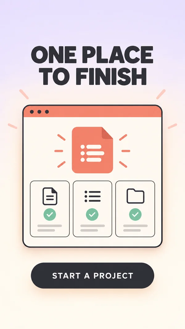
Beat 5 · 9.5s–12s · 2.5s
CTA
Product/result plus CTA.
- Motion
- Hold with <=2% gentle motion.
- Sound
- Resolve.
- Check
- No claim that the visual metaphor itself is proven to improve CPA.
Copy slot:CTA
Copy budget
Word counts are a starting point. Keep required qualifications.
- Problem7 words
- Pain detail7 words
- Turning point7 words
- Benefit7 words
- CTA4 words
Layer stack
Top of the frame first.
- 6CTA
- 5Headline
- 4Clean result card
- 3Pointer/accent
- 2Repeated UI windows
- 1Background
Adapt the format
- 9:16
- Use the reference composition. Check placement overlays with the actual destination preview.
- 4:5
- Reflow the composition into a wider canvas; increase useful media width and recheck every line break.
- 1:1
- Reduce vertical gaps; keep a single dominant focal point and preserve the intended reading order.
Review the finished ad
- Clutter clears completely before the result becomes the focal point.
- The result is a specific output, not just an empty clean screen.
- The final brand and CTA are fully settled and readable before export ends.
Watch out
- Do not reproduce another app’s private user data.
- Parent repeaters to a group whose duration ends at the transition.
Fallback. Use six explicit card groups and a hard cut to the clean state; avoid requiring a simulated desktop.
Variations
- 6 s: clutter 1.5 s, collapse 0.5 s, result 2 s, CTA 2 s.
- NodeTool adaptation: scattered deliverables resolve into one editable project.